 |
| Click here for the link to the video. |
AABC ~ Find it Quick...
▼
Wednesday, March 16, 2016
Tuesday, March 1, 2016
Eric Carle Hearts
Docent: Brandi Hennessy
Grade: 2nd
Date: March 2016
Medium: Paint, White Paper, Green large matting paper,
sponge dot brushes
Reason for Lesson:
We are talking about space…white space/negative space, and creating art by
making different use of our space. Our art project is going to use both
positive space, and negative space to create a dot out of smaller dots.
Label: Space
Prep Time:
Materials will be in the 2nd grade box. 8 ½ x 8 ½ paper with a
circle template on it. 8 ½ x 8 ½ white cardstock paper for the students to do
their 2 art projects on.
Preparation prior to
lesson: gathering supplies, printing circle template (I did it on a
not-white paper), cutting 8 ½ x 8 ½ squares of white paper for the actual
painting (2 per student)
Class Time: 60
minutes
Materials: Circle
template, white paper squares, matting paper (large), paint, sponge dot brushes
Step by Step
Instructions:
1.
Read The Dot by Peter H Reynolds (It will be in
the 2nd grade art box)
2.
Talk about negative space and positive space. We
are going to create two pieces of dot art—one using positive space and one
using negative space. Show the example:
See image dot (1)
3.
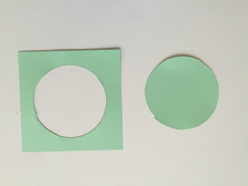
Hand out the colored square with a circle on it.
Students need to cut out the circle without cutting through/ruining the outside
template…we are using both pieces of the circle template as stencils.
See image dot (2) and image dot
(3)
4.
Hand out 2 white squares ( 8 ½ x 8 ½) to each
student. They will carefully tape the circle to the center of one of the
squares. They will carefully tape the negative circle template to their other
piece of paper.
See image dot (4)…note that you are only using two small
pieces of tape per page, and barely have it on the white paper.
5.
Now comes the painting of dots on the two pages
in the stencil area. I think the easiest way to handle the paint and sponge
situation (without having to constantly wash brushes) is to choose the 4 colors
you are using, and give each student a cup (or egg crate pieces, whatever) with
one color and one brush…for instance, create 5 cups of red, 5 cups of blue, 5
cups of green, 5 cups of yellow and alternate them between students. Have
students create dots with their one color, and then say “switch” and have them
pass their paint to the right so everyone has a new color. If you switch 4
times, each student will have a chance to use each color, and they are passing
the color AND the sponge so they wont have to wash their sponges until the very
end.
See image dot (6)
6.
Once their two pages are done, remove the circle
templates and then mat their two squares side by side on their larger colored
paper. Be sure their names are on the back!!
Final image dot (1)
Reference:
Here is some information on the book we are using:
Claes Oldenburg Hamburger Texture
Docent: Alicia Frank
5th Grade
Medium: Construction Paper, Fabric, tissue paper, yarn
Reason for Lesson: Lesson was designed to teach the element of art - texture using the pop art sculpture style of artist, Claes Oldenburg.
Prep Time: 30 minutes
Preparation prior to the lesson: Study pop art form Claes Oldenburg’s “Hamburger” sculpture.
Materials:
6 x 18 sheet of black paper
tan burlap, tissue paper, red felt, construction paper in different colors: green, red, brown, white
book binding glue
Instructions to Lead Lesson:
Talk about Claes Oldenburg as an artist and specifically his “Hamburger” pop art sculpture.
The important techniques while creating our hamburger art are:
- The art must have a plate, a hamburger patty and a bun.
- You may be creative and embellish your hamburger with anything you’d like to add on top, but your creativity must be a food item. If you’d like ice cream and sardines on your hamburger...the creativity is up to you.
- When cutting and gluing the items onto the black construction paper mat do not glue the items flat. Let the food fold and bend off the black mat. Add texture by folding, wrinkling and bending the paper. Add texture and shading details by using markers or crayons, or layering papers. Make the food look tasty and real.
Blog of other 5th grade artist’s Hamburger
I AM
Grade: 4th
Medium:
Tempera Paint
Reason
for Lesson:
Elements
of Art: Color, Line, Shape, and Space
Principles
of Art: Movement, Rhythm
Label: Color,
Line, Shape, Space, Movement, Rhythm
Prep Time: 10
minutes
Preparation
prior to lesson: Collect supplies from Art Closet (4th grade
bin)
Class
Time: 45 minutes – 1 hour
Materials:
Watercolor paper, tempera paint, paint brushes, paper plates (for paint), paper
towels, water cups, black sharpie markers, pencils, “I Am” worksheet.
Instructions
to Lead Lesson:
Brainstorm with the kids to come up with different emotions that correspond to different colors.
Have the kids choose four colors that represent them.*
Have the kids use those four colors to paint their I AM portraits. Make sure they use as little paint as possible to speed drying time.
TIPS
·
Have students first divide their paper in to 10 different sections
using wavy lines across the entire page using a pencil. Have them use 2-3 finger spacing between each line.
·
Talk with the students about how different colors give different
feelings and that each color may represent a different feeling for each person.
Blue may feel sad to one student or calm to another. There is no right or
wrong.
Brainstorm with the kids to come up with different emotions that correspond to different colors.
Have the kids choose four colors that represent them.*
Have the kids use those four colors to paint their I AM portraits. Make sure they use as little paint as possible to speed drying time.
· While sections are drying, have the students brainstorm ideas about themselves. Coming up with at least 15 ideas.
· Ex: I am Smart, I am kind, I am creative, I am nice, I am inventive, etc.
· When paint has dried, Outline each section in permanent marker.
· Using a permanent marker, have students write “I Am…” at the top and in each section write their descriptive words. Make sure the letters touch the top and bottom line of each section. (see below example)
· The last section students will write “I Am (their name)”.
TIPS
- A paint table might be a good way to distribute different paint colors for this project. Have a table set up in the back with all the paint colors and paper plates. As the kids choose their colors put a small amount of paint on a paper plate and hand them out one by one.
- One volunteer can be doing this while the Art teacher is brainstorming with the kiddos.
- Make sure the kids know to use VERY LITTLE paint for this project. It is going to need to dry before using the black sharpie
·
Credit: rundesroom.com
Funny Fish Drawing
Grade:
1st
Date: March
Medium: oil
and chalk pastels (black, red, yellow, blue and green)
Reason for the Lesson: Direct line drawing
TIPS:
The trick with a successful
directed line drawing is to make sure that the drawings are unique to the
child. Start a line drawing with a quick
demonstration on the white board. Talk about the steps as you draw, maybe even make
a few “mistakes” so children don’t worry that this drawing must be perfect. You
can also show “options” so children know they can alter any part of the drawing
to suit them.
I like to use this technique to
help control noise level and increase focus: I’ll say “When my marker cap is
off, your pencils are on the table.” This means that I am demonstrating a
drawing section. “When my cap is on, then it’s your turn to draw.” This means
that the kids know when to start drawing.
Prep Time: 10
minutes (to gather materials from art closet and head to classroom)
Class Time: 45-60min
Materials: One Fish, Two Fish, Red Fish, Blue Fish,
paper and pastels
Instructions:
1.
Start by
reading the story One Fish, Two Fish.
While reading the first couple of pages, focus student’s attention on
the fish drawings. What do they notice?
2.
Pass out
white paper.
3.
Students
will decide on the color of fish they would like to draw (red, yellow, blue or
green) and then use that pastel to create the fish drawing. They will outline
in black as the last step, and I would hold off on passing out black oil
pastels until the very end.
4.
Encourage
the children to draw an oval in the middle of the paper to form the fish’s body.
You may want to model this on the white board.
(steps 4-7 are also written on the next page, accompanied by the
step-by-step drawing)
5.
Add
an oval for an eye inside the body and extend the front of the oval by making a
nose of any shape. (model on white board)
6.
Add
any type of tail (use book as a reference), side fins and dorsal fins. Add a
bottom lip if desired. Don’t worry about all the overlapping lines, everything
with the exception of the eyes, will be colored in with the same color. (model
on white board)
7.
To
finish, add eyelashes, whiskers, and some crosshatching (very Dr. Seuss!).
8.
The
final step is to draw big, blue waves and then to trace over all lines with a black
oil pastel.
Credit:
www.deepspacesparkle.com
Texture Wave
Grade: Third
Date: March 2016
Medium: Rainbow Scratch Paper (available from Lakeshore Learning)
Reason for Lesson: Primarily to teach the principle of texture in art, also will touch on perspective, lines, and color.
Label: Texture, Line, Perspective, Color,
Prep Time: 20 min, ordering scratch paper, stocking art bin, printing handouts
Preparation prior to lesson: Read through lesson
Class Time: 50 minutes
Materials:
Rainbow Scratch Paper-
Available from Lakeshore Learning for 10.00 per 30 sheets,
Wooden Sticks for scratching. Some sticks come with scratch sheets, then supplement with wooden skewers (the ones for BBQ Kabobs)
Instructions to Lead Lesson:
See Blog for Pictures
1. Discuss Texture in Art, using example of Van Gogh and others. Here was a fun excerpt I found on Van Gogh, who lived 1853-1890 and created 2,100 works of art. Interestingly, he questioned whether or not he was good enough, as he only sold ONE of these works in his lifetime.
Largely self-taught, Van Gogh believed that drawing was “the root of everything.” His reasons for drawing were numerous. At the outset of his career, he felt it necessary to master black and white before attempting to work in color. Thus, drawings formed an inextricable part of his development as a painter. There were periods when he wished to do nothing but draw. Sometimes, it was a question of economics: the materials he needed to create his drawings—paper and ink purchased at nearby shops and pens he himself cut with a penknife from locally grown reeds—were cheap, whereas costly paints and canvases had to be ordered and shipped from Paris. When the fierce mistral winds made it impossible for him to set up an easel, he found he could draw on sheets of paper tacked securely to board.
2. Pass out and Work through provided handout on texture and drawing a wave
3. Pass out Scratch Paper and remember names on backs! Follow blog photos to create our “Texture Wave”
Credit:
www.metmuseum.org for bio on Vincent van Gogh


